
All Brandpa logos follow the following core guidelines:
Things to avoid
- Don’t include “.com” in the logo*
- Don’t use clipart
- Don’t copy an existing logo or symbol
* We advise our designers not to include the “.com” in the logo designs. That way, the logos will look clean and minimal. However, if the seller specifically asks for it (particularly when adding a “.com” will make for a more impactful brand), the designer can fulfil that ask.
Clean and modern
Our logos are all vectors, and almost never use drop-shadows, bevels, or textures. We never use gradients. Some examples:
-
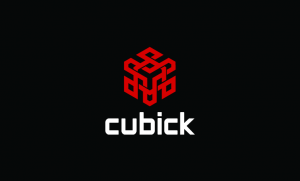
- Cubick.com
-

- BuyerPlanet.com
-

- Woochef.com
About half of our customers are in tech, so if you look at major tech consumer brands for inspiration (Google, Microsoft, MailChimp) you won’t go too far wrong.
In proportion
Our logos will all be displayed at a size of 800 x 480 pixels, so design for that aspect ratio. The logo should not touch the edge of the canvas, and should be centred in the middle with enough space around to make the logo clear.
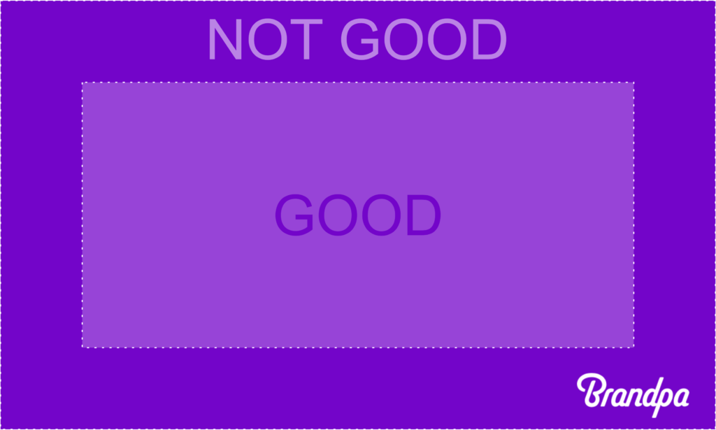
Please some examples below:

Design for screens
Logos will only be displayed on a screen, so optimise accordingly. Design and supply assets using RGB, not CMYK.
Your logo can also be shown on any background colour you wish, not just white.
Keep it simple
We prefer simple logos. A simple detail or effective use of a font can be enough to make a brand:
-

- Inki.com
-

- Zujo.com
Where illustration is used, we prefer you keep it simple. Finely detailed artwork doesn’t make for a strong identity. Here’s one of ours we like:
Need more?
You should browse our list of domains for a better idea of what designs we like. Still have questions? Chat to us in our design system, or click Submit a ticket above.