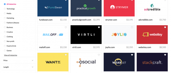
Today we’re pleased to reveal a vastly improved search experience for all of our users.
Infinite scrolling
The most common action for someone using our old search was to click on the “next page”. So we removed the need for this entirely: now, as a user scrolls to the bottom of their results, we automatically load the next page, like in your Facebook feed. The result is you can see more names with less work.
Better filters
We looked into how people were filtering their search results, and found most people used the Industry filter a lot, so we made that easier to use. At the same time, by adding a sidebar, we were able to introduce several new filters:
- TLDs (.com, .org, .ly, etc.)
- Length (characters and syllables)
- Pattern (consonants and vowels)
Pattern allows advanced users to filter domains by their consonant and vowel pattern, e.g. “cvc” would match three letter domains with a consonant followed by a vowel followed by a consonant. “*” matches any number of any character, so “cv*” would match any name beginning with a consonant and then a vowel.
Smarter matches
Having built our own internal analytics, we’ve been looking into what names get the best engagement from our users. Using this, we’ve optimised search results to show better matches first.
We also now have expansive support for synonyms, so for example, when searching for “tech” we might also find names tagged “software” or “SaaS”.
Overall we believe these changes significantly improve the shopping experience for Brandpa customers.

